PR Center
CI/BI
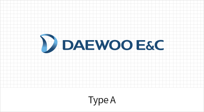
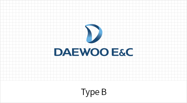
Daewoo E&C CI

Symbol
The Mobius strip motif is used as a symbol to express unlimited growth and eternity. The symbol also in corporates the “D” of Daewoo E&C, linking it to the idea of the company as a global leading player with its daring and passionate spirit. It consists of three units that signify technology, talent, and the future, which are harmonized for mutual development.
Signature
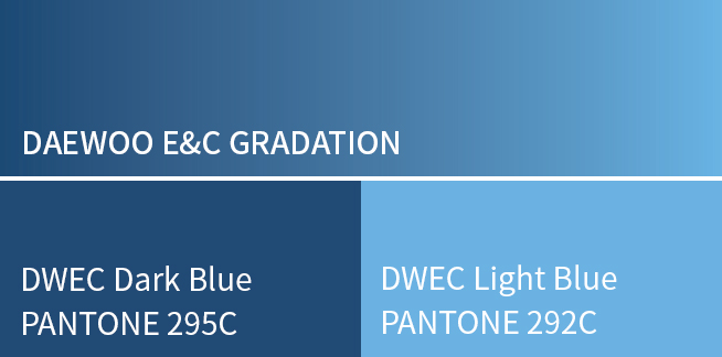
Color System
Blue, the traditional color of Daewoo E&C, symbolizes reliability, stability, and state-of-the-art technological power. With the color gradation, the symbol reflects creative change and a focus on the future for innovating sophisticated trends.
SUMMIT BI
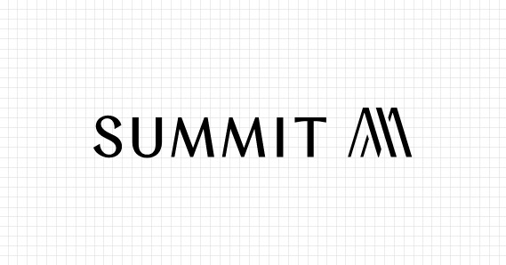
SUMMIT Logo
The SUMMIT logo represents the brand’s philosophy —the visual language of achievement and depth of existence. Each curve and proportion in the wordmark translates the journey of life into an architectural expression, capturing the quiet dignity and presence that define SUMMIT.
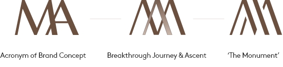
Symbol
Inspired by the brand concept “The Monument of Aspiration,” The symbol reinterprets the initials M and A into a refined monogram that conveys strong upward momentum and a commanding sense of existence. It becomes the sculptural essence of aspiration—where elegance meets confidence.
Signature
Signature BI
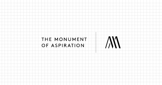
Left-right combination of slogan and symbol
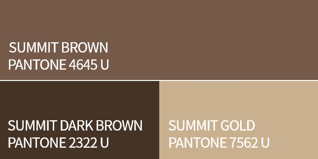
Color System
The SUMMITcolor system draws from the restrained, noble tones of Korean aesthetics —hues of earth and precious minerals that embody timeless sophistication. SUMMIT Brownsignifies profound authenticity, SUMMIT Dark Brownevokes influential presence, and SUMMIT Goldreflects excellence. Thesetone-on-toneharmonies express SUMMIT’s understated prestige —a beauty that needs no exaggeration, yet commands admiration.
PRUGIO BI
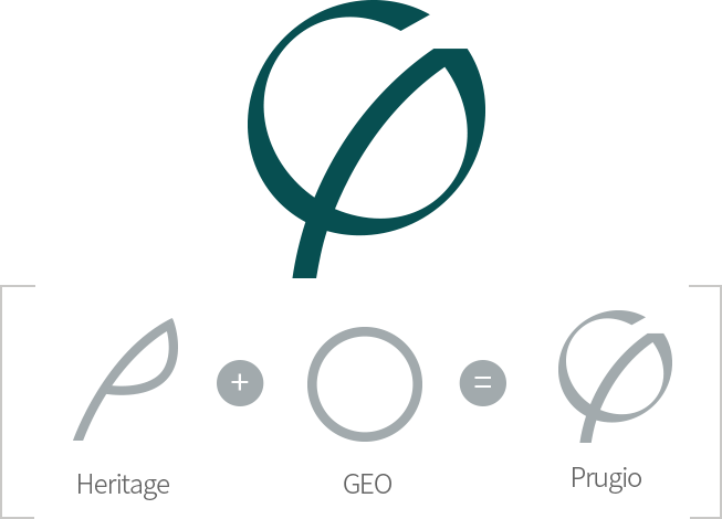
Symbol
The new Prugio symbol embodies the shape of natural elements swaying in a soft breeze. The strong, but also pliable blade of grass swaying in the wind embodies the luxurious image of Prugio, in which premium extras are added to the fundamentals.
BI Character
This character is a combination of the P Tree, which is the heritage of Prugio, and a circle, which represents the earth. This logo-type character contains the essence of Prugio and backs up BI. It represents the new Prugio, evoking the idea of harmonization rather than something that can be confined to a frame.
Black is the New Green
Prugio illustrates more profound, premium residential space with ‘Black is the New Green.’ The British Green reminds of a warm coat, cashmere, and leather accents, with a drop of luxurious black ink deposited on the existing green of Prugio.

04548 Daewoo E&C 170, Eulji-ro, Jung-gu, Seoul, Republic of Korea
TEL : +82 02-2288-3114
Copyright © DAEWOO ENGINEERING & CONSTRUCTION Co., Ltd. All rights reserved.